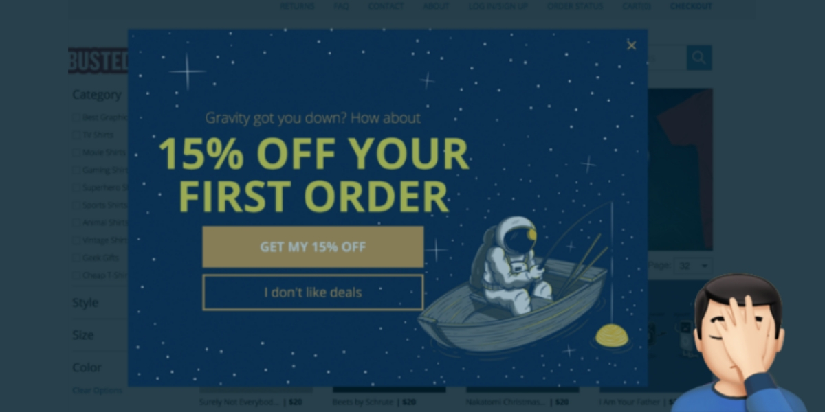
That Awesome Popup On Your Website—Get Rid Of It!

As the Google algorithm continues to evolve, mobile search remains the center of attention. In a blog post on the Webmaster Central Blog, Google stated that they are taking a more active interest in ‘helping users find the content they are looking for.’ Allow me to translate.
Google is Penalizing Website with Intrusive Mobile Pop-up Ads
Does your website show a pop-up ad, a welcome mat, or similar offer when a user enters your website on a mobile device? If the answer is yes, it is time to consider a change.
To make content easier to find, Google will now penalize websites that display “annoying mobile interstitials.” Interstitials are those pop-up ads I mentioned above. If you have ever been to Forbes’ website, you know exactly what I’m talking about.
As defined by MarketingTerms.com, an interstitial is:
An advertisement that loads between two content pages.
One of the most common interstitials is the pop-up ad. Another emerging format is a full-page ad that interrupts sequential content, forcing exposure to the advertisement before visitors can continue on their content path.
Interstitials are a form of interruption marketing [and] often draw an above average amount of response and resentment. The high response rates typically translate into higher CPM rates. The high level of resentment may translate into consumer backlash, although the exact long-term effects are unclear.
These Pop-up Ads Work Great, So What’s The Problem?

If these strategies have proven highly effective for many businesses, why is Google doing this? The answer is simple: Accessibility and Intent.
The user didn’t click on your link to look at an ad or offer. That was not their intent. They clicked to look at what the page has to say. Furthermore, by displaying a popover or welcome mat, the user must then navigate that feature of your site to access the content they want to see.
Annoying, eh?
What Can You Do About It?
Moving forward, marketers will need to find new ways to showcase offers or encourage users to subscribe to an email list. Furthermore, although ‘annoying interstitials’ will be getting penalized, Google clarifies that there are non-intrusive ways to display offers that take up a ‘reasonable amount of screen space.’ Our solution, use them when the visitor is leaving your website.
Do you use techniques like this on your website? How have they worked for you? Let’s chat in the comments!
Speaking of social media, make sure to give us a follow…
Bringing Hope, Safety & Empowerment to Children Recovering From Human Sex Trafficking.
How We Give
Through our partnership, we contribute 10% of your monthly investments to INH.
Ready To Discuss Your Project?
More Insights From Marketing Experts
7 Reasons A Custom Website Is Key For Business Success
Owning and operating a small business poses some unique challenges in this modern age of high-speed technology and even higher-speed information consumption. Initially, having a custom website was reserved for only the most tech savvy entrepreneurs with the right...
read moreHow PageSpeed Can Boost (Or Bust) Your User Experience
There is a strange misconception amongst business owners these days. Many people believe that their website must have tons of bells and whistles, because consumers will immediately fall in love and want to spend their money. Right? Well, no… not exactly. In fact, a...
read moreWeb Design Best Practices 2019
Three seconds. That’s about how much time a visitor gives a website before they decide whether or not to stick around. If you have noticed your website has a high bounce rate, it might be time to explore a redesign using these web design best practices. 5 WEB DESIGN...
read moreReady To Discuss Your Project?
Our Certified Marketing Specialists will get your business noticed.
Call today to more about how we can help your business reach its full and profitable potential online.
Call (949) 284-7088
or


